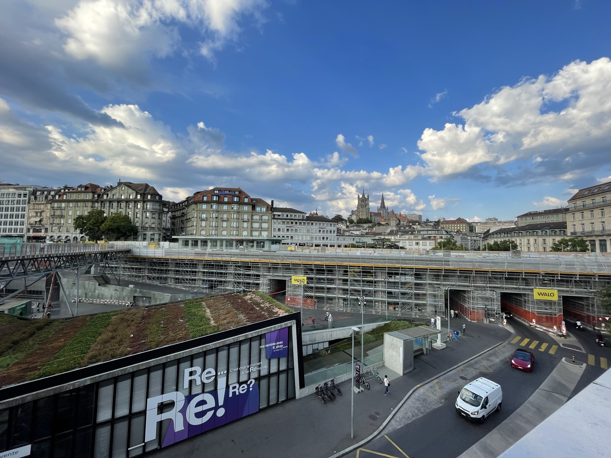
Helvetica from Cambridge to Lausanne
Helvetica (2007), produced and directed by Gary Hustwit
“Helvetica is a feature-length documentary about typography, graphic design and global visual culture. It looks at the proliferation of one typeface as part of a larger conversation about the way type affects our lives. [… It is] a fluid discussion with renowned designers about their work, the creative process, and the choices and aesthetics behind their use of type. Helvetica […] invites us to take a second look at the thousands of words we see every day.”
I really enjoyed this documentary. Part of the reason is, of course, that I am already a little bit of a typography geek—for instance, this domain name alludes to an old typographical curiosity. But part of it is also that the documentary presents critical perspectives on something that is both so artistic and so utilitarian, that lives simultaneously in the subjective worlds of aesthetics, design, culture, human psychology, and in the cold objective worlds of street signage, corporate identity, marketing. Featuring takes from “no type can ever do better than Helvetica at what it does” all the way to “Helvetica caused the Iraq War”.
I highly recommend Helvetica if you are interested in design or typography. It has definitely got me thinking a lot more about the type I see everyday, and whether I could make more thoughtful type choices in technology I use everyday or what I present about myself to the world, like my resume or website. A word of warning, though, that the documentary will corrupt your eye forever (as it has corrupted mine) to spot Helvetica out in the wild. And it is everywhere.

Not very far from the location of the photo above is the home of the MIT Technology Review, which I discovered (while deep inside one of my Helvetica-induced typography rabbitholes) actually has a long history of ‘modern’ design. Their article about their 2018 redesign goes into some detail about their design and branding principles. Featured in the article are some layouts for the magazine from the 1960s that surprisingly don’t look old. Fun fact: their headline typeface used to be Helvetica, but now it’s the closely related Neue Haas Grotesk, and I really like their body text typeface called Independent, originally created for a British newspaper of the same name. I almost didn’t notice that the word “Technology” in their logo is cleverly offset for better alignment. [sidenote: Also their content is pretty good on the whole if you’re interested in broader tech news. Much less focused on MIT or Silicon Valley tech bros than you might expect.]

A week after the first photo, I moved to a different continent, but Helvetica seems to have followed me… Rather, perhaps, I have followed it to its home country of Switzerland, a.k.a. Confoederatio Helvetica. And lest I feel confused and alone in my new life, institutional branding guidelines are here to comfort me! EPFL’s visual identity is defined by the letterforms ‘EPFL’, based on Helvetica Neue, modified to reflect the 7:6 proportions of the Swiss cross, and of course in Swiss red whenever possible. The official typeface is Suisse Int’l which at a glance I cannot distinguish from Helvetica but I’m sure is significantly different for a professional.
Goodbye, Cambridge! Hello, Lausanne! May I find inspiration in your fluid constancy, Helvetica!